RECENT POSTS


01.March.2023
eLuxury Blog: eLuxury Mattress Pads Meet Flammability Standards without Flame Retardant Chemicals
0 Comments
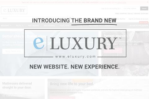
Introducing the NEW eLuxury
Web design trends and standards are fickle things. What works one day is obsolete the next. As an e-commerce company, we’re constantly trying to find ways to improve our websites to better serve you, our customers. How can we make products easier to find? How can we keep you engaged with our site? There are a thousand different blogs on the topic and a thousand more user experience “gurus”. In the end, my best route was going with my gut.
As the lead in-house designer here at eLuxury, I’ve been looking at essentially the same website design every day for three years or so. The thought in the forefront of my mind became “this site got us this far, but what can get us further?”. Bearing that in mind, I set forth researching ways to better our website, our brand, and how you interact with each. After about a month of Googling, researching, designing, refining, and working with our programmer, we finally produced a product our team was happy with. As of this past Friday, May 11, I’m happy to say that eLuxury’s facelift is live. What’s new? Let's run through all of the new features together as we go about introducing the new eLuxury!
The Home Page
Right off the bat, it’s clear to see that this is a brand new website -- not merely a slight revision. For simplicity’s sake, I’ll break this down into key points:

1. HOME PAGE BANNERS: The home page “slider” is gone.
That is, the huge images at the top of the page. In its place are four promotional images. This allows us to present you with four quick links all at once versus one at a time. This alone is a time saver for users.

2. SALE BAR: At the very top of the page, in a pink bar, you can see our latest sale. While we run many of these sales via email, we realize not everyone gets and/or reads these emails. This is a quick way for us to share our latest deal with you. Don’t want to see it anymore? Click the X at the right. We don’t feel the need to nag customers.

3. EASY NEWSLETTER SIGNUP: At the top of the page you’ll find a signup box for our newsletter. This makes it much easier for a user to signup for our mailing list and receive the deals I mentioned above.
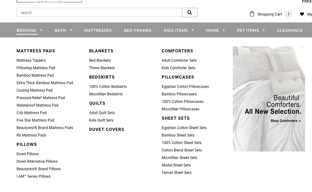
4. IMPROVED NAVIGATION: The biggest change here is the navigation bar. We have greatly expanded our navigation menus. Want to find bamboo sheets? Now you can do so with one click. Product categories are subdivided right within the menu. We can also show you new products or deals with images embedded into the menu(s).

5. PAGE BODY: We’ve kept our about us video intact, as we believe it to be key to our brand’s image and mission. Below this, you’ll find a new “Featured Products” section to quickly find best selling items.

6. BLOG POSTS: You’ll notice our recent blog posts section is much larger. This is to call attention to the blogs that we believe are all very helpful to our customers.
COLLECTION PAGES
A lot of attention went into the product collection pages. The goal here was to make it as quick and easy as possible for you to find what you’re looking for. In addition, it also makes it simple to “window shop” if you’re not 100% on what you’re looking for.

1. GRID VIEW / LIST VIEW: At the top you’ll notice the ability to view products in a grid or as a list. This is a common feature used by many popular online retailers. This allows you to customize your shopping experience on the fly.

2. PRODUCT FILTERING: We’ve added the ability to filter products down to very specific details. This includes, size, color, pattern, price, and more. No more scrolling 'till you stumble across what you want. Have a budget in mind? Use the price filter. Simple as that.

3. Product Selection Options: When hovering over a product, you’re presented with three options: a “quick view” that brings up a popup window to show you product details without leaving the current page you are on, an “Add to Wishlist” heart, and a “Select Options” button which will take you to the product page itself.
PRODUCT PAGES
Now that you’ve made your way to a product you’re interested in, we’ve made it easier to find the info you want to know as well as key bits about the ordering process and related products.
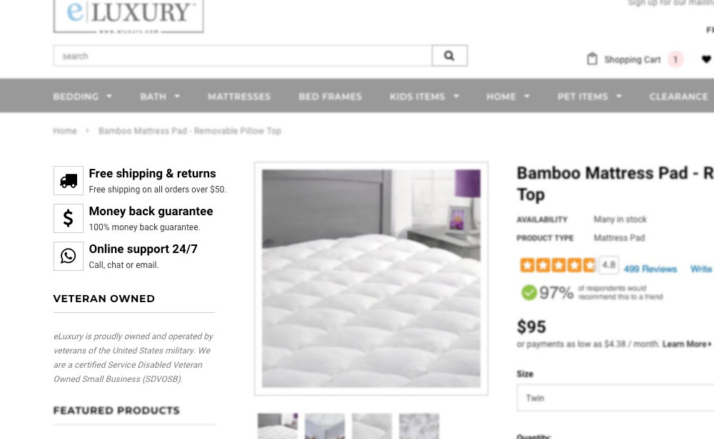
1. BRAND INFO: to the left, you’ll notice a few key factors about us to help assure you that should you choose to purchase the product you’re viewing, you can do so with confidence. This includes info about shipping, our money back guarantee, customer support, and our veteran owned status.

2. IMPROVED REVIEWS: we have upgraded our reviews system. The new system shows you at a glance what percentage of customers would recommend this product. Want to see more reviews? Simply click the total number of reviews or visit the “Customer Reviews” tab below.

3. PRODUCT AVAILABILITY: you can now see immediately how much stock we have on hand by looking at “Availability” under the product title.

4. TIDY: overall, the product page has been cleaned up and de-cluttered. We’ve narrowed our color palette and made everything very intuitive to browse and select. This makes for a clean and simple experience when using our website.
Miscellaneous
Here I’ll summarize changes made across the website that do not necessarily fit into any one category.
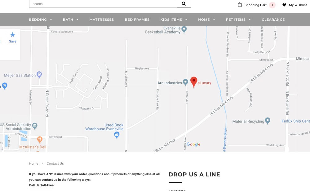
1. CONTACT US: this page is one of my personal favorites. The first thing you will notice is a large Google Map of our location here in Evansville, IN. This assures customers we are indeed a United States based company (and proud of it). You will also find all of our hours, contact information, and a handy contact form. This is all in addition to our live chat box that resides at the bottom left of the screen at all times. We’ve made it easier than ever to get in touch with us.
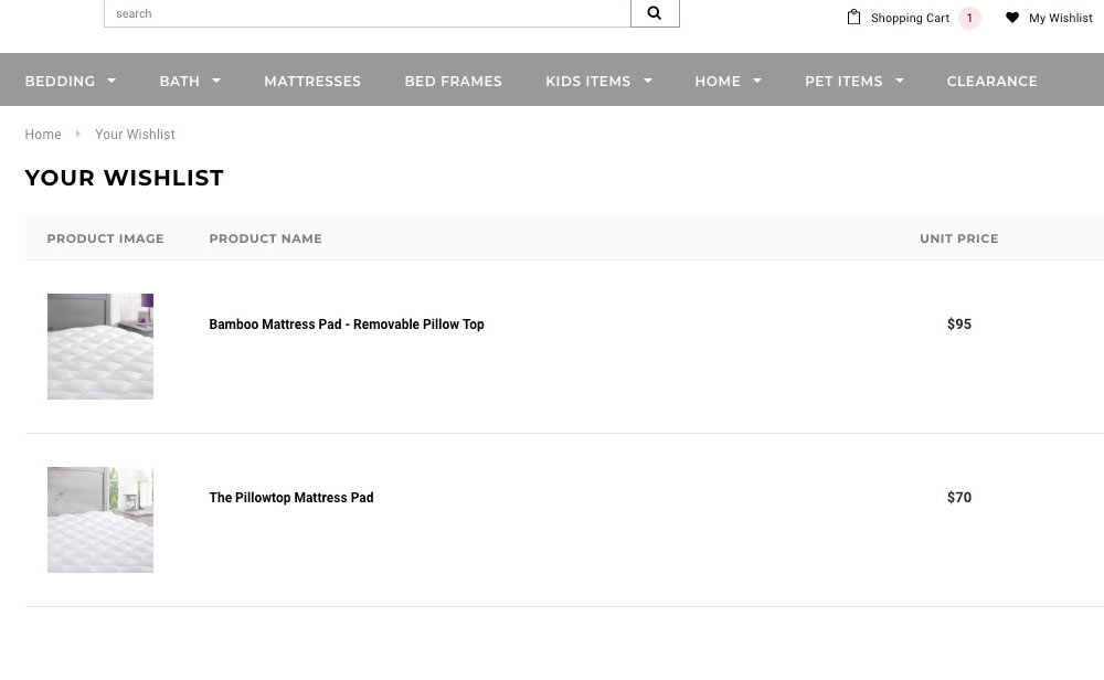
2. WISH LIST: once you’ve created an account with us, you will be able to save products to your wishlist and hold on to them for later. Simply click the heart on a collection page or “Add to Wishlist” on a product page. Never lose track of a product you’re interested in!

3. SHOPPING CART: hover over the shopping cart icon to see a quick at-a-glance view of what is currently in your cart. Ready to check out? Simply click the Checkout button and you’re on your way to owning a bit of luxury.
SUMMARY
All in all, this new look for eLuxury is a top-to-bottom overhaul. Overall, the design is much cleaner, modern, and reflects our brand name. This site quite simply says “luxury”, and that is exactly what you get when shopping with us. I am very proud to roll it out and allow you to shop, explore, and let us know what you think! In the coming days we will continue to improve, expand, and add new features. Welcome to the brand new eLuxury 2.0!